Peter Ablinger:
WEISS
For me, "weiß" (white) may be the most seductive word of all. I´ve dedicated the most pieces to it, and not just the ones with "weiß" in the title. Add to this the fact that there is also such a thing as white Noise [weißes Rauschen], and that this is for once not just another metaphor borrowed from some other sensory region (typically optics), but-color terminology aside-an originally acoustic expression. With Noise, I have something which does not involve transference from the get-go-already something of a small miracle when it comes to the relation between music and talking about music. In a reversal of the norm, Noise has been dragged into everyday speech by information theory, and can refer to anything redundant, contingent, impossible or difficult to communicate.
Noise is called "white" if all its frequencies are equally strong. In this respect, there is indeed a parallel to light. But only as long as I am primed to imagine this Noise, this Everything, as LOUD. In any other case, the comparison is lost. The definition, "all frequencies equally strong" says nothing about volume (energy), so white Noise is still white Noise when it´s very soft; and it would be mathematically correct to say that the same applies if it is infinitely soft, if there is an absence of all energy, which, in terms of light, would correspond to black.
Whether black or white, Noise´s density, amorphousness, and coloristic names (we also talk about pink Noise and brown Noise) make the comparison between noise and surface seem all but inevitable. Thus transference rears its head yet again: this time retroactively.
Back Transfer:
In the first version of Weiss/weisslich 7 (1994), Noise is left in its organic, undesigned, undeveloped, unlimited state. At the same time, I was sketching the piece Quadrat [Square] for a single loudspeaker, which consisted of exactly four minutes of white Noise. This should, of course, have been the better translation of a white square-better, because (loud) Noise, with its capacity for absorption and for masking quiet background noises (stomach grumbles, etc.), is somehow more silent than silence; and because, unlike Cage's 4´33", it refers directly back to Malevich's original without Rauschenberg´s intermediary translation. But however much speculation is involved in this consideration, the real question is: how long does Noise need to be in order to become a square? Or, more technically speaking, is there a compulsory relationship between bandwidth (spectrum) and duration? Is there an obligatory measure of duration? What is a square in music? One might further speculate that, if the spectrum is white and therefore infinite, the duration must also be infinite. But I´ve never found anyone who could confirm this; on the contrary, most people would tend to associate the long duration of recorded Noise with some sort of extended rectangle. I always meant to pursue this further: I wanted to play Noise for different friends and colleagues, and ask them how long it needed to sound in order to be perceived as a square. The individual pieces of the resulting series would then be called: Square for Klaus Lang, Square for Maria de Alvear, Square for Daniel Rothman, Square for Jürg Frey, Square for Alvin Lucier, Square for Makiko Nishikaze.
I learned from Gösta Neuwirth (who learned this in turn from Heimito von Doderer) that problems are never solved on the same level at which one first encounters them. A few months later, this problem was solved in realizing that it wasn´t a problem at all. As I started to transfer my ideas about sonic density to instruments in late 1994, as the density and sound quality of the moment usurped the place of process and structural change, as color replaced time as the dominant focus, the fundamental revaluation of the spectrum revealed a possible equation with respect to time (IEAOV: Instruments and Electro-acoustic site-specific densification, 1995-present).
- f = t
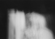
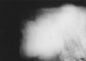
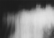
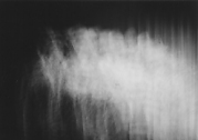
Densification transforms all temporal succession into the simultaneity of a spectrum. What was recorded as a sound sequence (a "palette") returns as a sound color.*h Every component of each sound, not just its pitch but its attack, decay, swell, is crucial to the resultant color. The temporal process is no longer differentiated from the spectral. Time has become identical to color. f(frequency)= t(time).
 |
 |
 |
 |
 |
 |
 |
 |
 |
 |
 |
 |
(below is the notebook entry in which I plotted out these intentions):
- Densifications:
Sounds, musics, and sound structures (as well as concretes sounds), environmental recordings) staggered like the rooms in Wilhering Abbey, lined up behind each other. Keep searching for the point where they start to intertwine, become transparent to one another, turn toward one another; when they give up their respective solitudes, their uniqueness for the sake of the bigger picture. Locate the precise point at the brink of dissolution, not yet cancellation but multiplication.
But also:
Drown sounds (so to speak): in other, denser sounds. Die Walküre in a waterfall, a trombone chorale on a highway, a Mozart quartet in a late Coltrane record, Cecil Taylor in a swarm of cicadas...
dissolve, resolve, redeem everything!
Take it all back to the point where it is an inkling, a possibility. An appearance. An apparition-only for the most attentive. For everyone else: an impenetrable wall.
-I think it's now time for the large, almost-white surface, glaring, impenetrable light, it's time for Turner...no details in the moment, broad strokes, improvisational schemes-start here.
For now: preparations. Go to the studio. Allow experimentation. Collect. Listen. Don't write much. Maybe texts. Prose. Noise notebook etc. Just listen to sounds, don't write them. For a while. Today is 12/18/94. A while = e.g. 9 months.
 |
Sketch for: IEAOV, Homage to the Square, 1995-99 |
Homage to the Square.
The square didn't-and still won't-let me out of its grasp. One of the IEAOV pieces, which I still haven't managed to bring to an end, despite multiple performances, is called IEAOV: Homage to the Square, after the eponymous series of more than 1000 paintings by Bauhaus painter Josef Albers. I've examined twelve of these in great detail, on numerous visits to the Berlin "Kupferstichkabinett." [The Berlin Museum of Prints and Drawings]
- Homage to the square:
create Noise surfaces like primary colors
then mix, combine, layer
the interpenetration of color planes
For Josef Albers, it's not so much about superimposition as independently calculated color combinations-really just colors next to each other-but the squares, which (seem to) frame each other, make the colors bleed into each other, which can-if not observed consciously-also make them appear to be on top of each other.
...The possibility of simply letting colors do their thing, of seeing how a high and low band can work together, or a high grainy one and a low smooth one, or a dense (narrow) and a sparse (broad) spectrum...
...the way colors influence each other. the way surfaces simply react to light: to different spaces and the current acoustic moment
- Albers' Paintings (print series Homage to the Square, 1967):
The surface is flawless, the ends (edges) are absolutely straight.
But then I see blotchy, dingy colors, like watercolors applied too thinly, and I see ragged edges, even the outer edge, where it meets the white paper: ragged, I think I'm seeing brushstrokes and bleeding colors...-I look at the painting again.-Nothing. Absolutely perfect.
Furthermore: extreme sensitivity of paintings to the slightest shift in viewing angle: the square immediately becomes a rectangle. If I shift the painting´s stand just 1cm with respect to incoming light (which is, incidentally, quite subdued and regular-thanks to the print gallery!), the paintings register this immediately. They notice right away!
I think gray may be somewhat less sensitive to "dirtiness." Green, too-as compared to yellow. Maybe shades closest to primary colors-or unmixed ones-are more sensitive?
Albers is fascinating from the distance where everything starts to blur, to vibrate, where various complementary reflexes go into effect.
But there's something strange, something touching in proximity to the paintings: I think they tremble, as though afraid of closeness. They seem naked, unprotected. You feel how little materiality, printing, making has to do with the "soul" of these paintings. The paintings themselves don't want you to see this. They're embarrassed.
The first painting from the Berlin prints:
a stage, an introduction, getting lighter towards the back: medium brown, purple (dull, almost a bit gray), blue-green, meadow green; the 3 interior surfaces are somehow corporeal, "transparent" (glowing! Shimmering from the inside out! As opposed to "flat" or "dense, solid, opaque"); they relate to each other, while the exterior brown is "flat"
Size of the squares: outermost square: 50x50cm, 900 cm2
2nd square: 40x40, 700 cm2
3rd square: 500 cm2
innermost square: 400 cm2
second painting: light, once again lightest at the center: from outside in: ochre, green-yellow, flesh color, yellow; the central yellow is still "flat" despite being the lightest, perhaps because it stands out from the outer colors to the same degree that the outer three are gently graduated and interacting
3rd painting: dark blue-green on the outside, the inner 3 are gray: medium, medium-dark, and dark gray at the center; still, none of the 4 colors is either completely flat or really luminous, they are related in this regard
4th painting: from outside in: yellow, light ochre, brightened brown, orange; two richer tones on the outside vs. 2 mixed, brightened shades inside; greatest brightness difference between 2 and 3! numerous interactions; no clear 3:1 relationship as in the first 3 paintings; 2 different possible pairings: outer vs. inner, or inside and outside against the two middle squares
5th painting: only 3 squares: 50x50, 40x40,29, 6x29, 6cm colors: burgundy, purple-red brightened with white, red; all three colors are shades of red
6th painting: 4 squares again: dark green, turquoise, medium-light gray, matte yellow: dynamic gradation of lightness; all 4 colors are mixed, and therefore equivalent: the gray, too!-high degree of balance gives it a very "kinetic" effect
seventh painting: like the fifth: 3 squares: Prussian blue, gray-violet, brown; incremental gradations through very close degrees of lightness (or rather darkness); strong flickering, Op-Art effect; the gray-violet is particularly iridescent, its edges seem to dissolve
eighth painting: 3 squares, with the so-called second from center left out; measurements: 50x50, 40x40, 20x20cm; colors: gray, green, yellow; sharp contrasts
ninth painting: 4 squares: dark gray, dark green, green, turquoise; very incremental again; related to seven and five; outer gray has a violet cast, and the highly mixed dark green seems to flicker the most, like a whisper on top of the gray-violet
ten: 4 squares, all yellow/yellow-ochre
eleven: 4 squares, from brown to orange, outer two are dark brown, inner two shiny orange/red-orange
twelve: blue, blue-green, 3 squares, 50x50, 40x40, 20x20, blue-green, dark Prussian blue, midnight blue; highly spatial, also fits with five, seven, nine
- Thus a performance consists of:
A) preparing the pigments: the player plays raw material, e.g., a microtonal scale
B) mixing the colors: the raw material is electronically densified into a flat surface
C) the piece, the variations, the series: player and densified surfaces play together.
- The piece which first addressed the prohibition of images (Verkündigung [Annunciation], 1990) deals with flickering structures, in which one hears little illusions, apparitions. One hears something like a figure, which no one is actually playing, but which is rather contained in the flickering. This has, incidentally, nothing to do with Ligeti's illusions. For Ligeti, illusion lies only in the difference between meter and rhythm; everyone hears the same thing. It's similar to baroque painting: a false architecture, which everyone naturally recognizes as such. But in my case it's about illusions which are not constructed. Everyone hears something different. It's about the disappearance of the imagistic.
- I'm not simply interested in the object, the objective. I would rather find out how we behave towards it. For it is this behavior that creates reality. I don't just want to listen. I want to listen to listening.
Light plays a decisive role in the development of all these concepts related to "Noise," "white," "densification," "surface": the observation of natural light and the study of light effects in the arts of past eras. Below is a note from 1991, after a visit to the Cathedral of Brno:
- Noise and Light. Refractions.
Stained glass windows:
First, the architecture, shape, and partitioning of the windows, as well as the small rods which support them and the coherent arrangement of multiple windows or window parts around the polygon of the sanctuary, or as a rose window, etc.-the geometry, the ornamentation, the composite, the symmetrical arrangement of patterns out of tracery and pane shapes.
Second, the drawing and the color; the drawing is often identical to the lead rods, the color often identical to the drawing; different relationships between color and drawing: identity; congruence (the same contours); or apparent identity: color may fill in the details of the drawing's contours, but, in a broader context, takes on its own life independent of the drawing. Then the primary and secondary relationships: the superimposition of regular, architectural-ornamental patterns and irregular, figural drawing; an overlapping of two independent, at times wholly unrelated structures within one window: the general (ornament) and the individual (figural representation). And furthermore the asymmetrical application of color, which can utterly transcend these forms, starting in one window and continuing in another, rising above architecture and drawing to create a shimmering, intricately refracted "imitation of light"-the principle of "Light."
Finally, the real, natural light from the sun outside wanders through, illuminating (accentuating) the stained-glass windows differently according to the time of day, with different intensities and degrees of contrast depending on weather and seasons. Light is thus a time-based operation, a clock. Depending on the time, light changes the power of color, the significance of the drawing, the form of architecture (light cracks the symmetry of the space, but is itself the most regular thing in the world).
It is worth noting how the different layers of stained glass windows relate to each other, and the impact of these ever-changing interactions: how they mesh into one another and create fluid transitions from one layer to the next (a vertical mobile!): from architecture to drawing, from drawing to color, from color to light. Superimposing the symmetry of space with the symmetry of time produces a highly complex structure. Thus: symmetry and regularity, two simple, basic systems, when overlayed correctly, produce complexity : life.
(Maybe expand on this with a sort of negative layer: the relative darkness that frames the stained glass windows throughout the day and allows them to shine-and with that the corresponding reversal at evening vespers, when the windows themselves are dark and only their architecture, framing, and rough drawings are visible, while the interior spaces and boundaries gain significance.)
Of all the many impressions or influences which have affected the concept of surface or flatness in my work, I will mention only those few which do not pertain to art or culture, but are nonetheless the most fundamental and immediate for me (though they may be less discursively inclined): wind in different grasses and trees, the sound of rainfall, the beginning drizzle, the color of the sky (Weiss/weisslich 18, 1992, 96, Regenstück [Rain piece], 1993, et al.) I remember once crying out to an evening sky, whose colors were morphing from blue to green to orange and purple, that this was precisely my musical goal. If I haven't reached this goal by now, I've probably come closer than anyone else. Feldman thought that what he was doing had to do with surface, with flatness. Compared to Stockhausen, maybe. But compared to IEAOV or even certain Noise pieces, Feldman is still working graphically. One could say that he placed his sounds in two-dimensional space, in the sense that the sounds exist on the same level and not at different spatial depths. The IEAOV surfaces still have depth, whereas my Noise pieces dispose of their own depth in the moment they rid themselves of characteristic foreground forms. Space is transcended, enveloped, but no longer represented or recreated. Rain, the Noise of a waterfall, and other events outside music history, as well as non-sounding arts like painting, awakened me to the need for a total absence of structure, for a flatness which can only be associated with light. It's really not about the surface of painting, as Feldman thought. Feldman's flatness is that of fabric. It's never the flatness of a monochromatic panel.
Structurelessness, redundancy, contingency, skirting the margins of what is communicable as art-all this can come off as "reductionist" or "minimalist." Or sometimes its opposite (maximalist?). Something like "style" is much too superficial for me. A hat you can put on and take off. In any case, there is truly no minimalist dogma in my work. The highest law of artistic minimalism is that a thing (a sound, etc.) can only be itself and nothing else. Maybe it's the Alpine hills, the Celtic strain in me, I don't know, but the best reaction such a thought can elicit from me is a sympathetic smirk.
- A yellow blue.
I'm standing in front of a small monochromatic blue painting by Yves Klein in an exhibition at the now defunct Berlin Guggenheim. The rectangular painting is roughly so large that I can imagine my own life-sized bust inside it-and that's just the point. This is what happens when you stand here: despite the absolute monochromaticism and formlessness: despite this-or precisely because of this-you envision yourself inside it.
There are also some Rothkos in the same exhibition: but in comparison with the Klein, the Rothkos are "figurative" in a traditional sense, i.e. they invite you to imagine figural representations. The surfaces suggest bodies-we may have no choice but to paint figures, or see figures, or both at once.
We may have no choice, but it's still crazy: I stand in front of the uniformly blue painting for a little while, and soon enough I perceive it like a Madonna icon. I feel the bodily contours, I feel the gaze, I feel that something is watching me as I watch something, something which feels like a someone. And this all happens only because I am looking at the painting. Because I am looking at the painting rather than another painting looking at the painting. The Klein could only be monochromatically blue if its beholder were likewise a monochromatically blue painting. Even if a yellow painting were watching, there would probably be some inevitable yellow cast to the blue painting-or a differential (green!)...
9/01
- Black (Ad Reinhardt quoting Hokusai):
"There is an old black and a new black, shiny black and dull black, black in sunlight and black in shadow. One should add blue for old black, white for dull black, and pitch for shiny black. Black in sunlight should give off gray reflections."
full text:
METAPHORS 1983-2004, in: "Peter Ablinger, Von Bockel-Verlag, 2019
See also the documenations on:
Weiss/Weisslich 12, Churches of the Mark Brandenburg
Weiss/weisslich 15, 5 Rooms, Coloured Silence
Weiss/Weisslich 18, Trees Noise
Weiss/Weisslich 24, Churches of St.Lambrecht
Weiss/Weisslich 26, Sketches for an Arboretum
Weiss/Weisslich 30, Reed in Pots, Wind
Rauschen / White Noise
Texte und Überlegungen von (mit) Peter Ablinger zum Thema Rauschen:
RAUSCHEN/HYPOTHESEN, 1991-95
DER WASSERFALL, 1/1993, ein Gespräch mit Karl-Heinz Dicht
RAUSCHEN/STICHWORTE, (1990,)1995
WEISS/WEISSLICH 18, 11/1999
SCHNEE (2), 12/1999
Schwarz / Black:
Black Series
Schwarzes Rauschen/ Black Noise
"Weiss ist schön"
Schwarze Liste / black list
